2021. 5. 15. 15:11ㆍData science/Python
Exploratory Data Analysis(EDA)
- to summarise the miain character of the data
- uncover the relationships between different variables
- extract important variables for the problem
- What are the characteristics that have the most impact ?
Descriptive Statistics
- before building models, it's important to explore the data first
- Calculate some Descriptive statistics for the data
- help to describe basic features of data set and obtain short summary, measure of the data
- numerical variables: using the describe function in pandas: basic statistics for all numerical variables
: df.describe(), df.describe(include=['object'])- this will include object types too
- if the method describe is applied to a dataframe with NaN values, NaN values will be excluded
- categorical variables: can be divided up into different categories or groups , using function value_counts
: df['drive-wheels'].value_counts()
: only works on Pandas series, not Pandas Dataframes. -> we only include one bracket "df['drive-wheels']" not two brackets "df[['drive-wheels']]".
: convert the series to a Dataframe -> df['drive-wheels'].value_counts().to_frame()
: returns a Series containing the counts of unique values
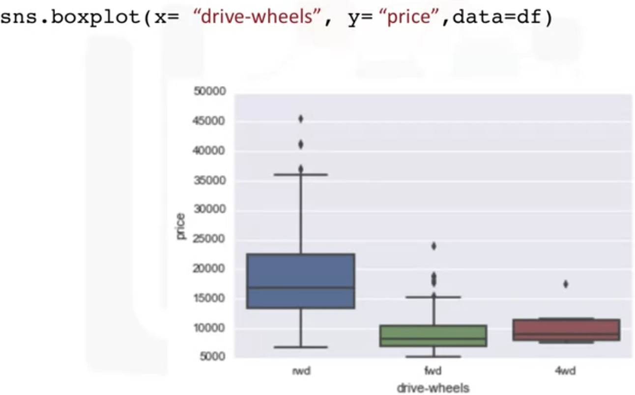
- Box plot
: good to visualize the numeric data
: good for the different group comparison, distribution of each group


- Scatter Plot
: continuous variables in our data(numbers in some range)
: observation represented as a point
: predictor/independent variables on x axis & target/dependant on y axis
: make sure to label the x and y
: this scatter plot shows the positive , linear relationship between the variables
GroupBy in Python
- use Pandas dataframe.Groupbu() method
: on categorical variables
: single or multiple variables
df_test = df[['drive-wheels', 'body-style', 'price']]
df_grp = df_test.groupby(['drive-wheel','body-wheel'], as_index=False).mean()
df_grp
- Pivot() in Pandas
: one variable displayed along the columns and the other variable displayed along the rows
df_pivot = df_grp.pivot(index='drive-wheels', columns='body-style')
#  drive-wheels displayed along the rows, body=style along the columns


grouped_pivot = grouped_pivot.fillna(0) #fill missing values with 0
grouped_pivot
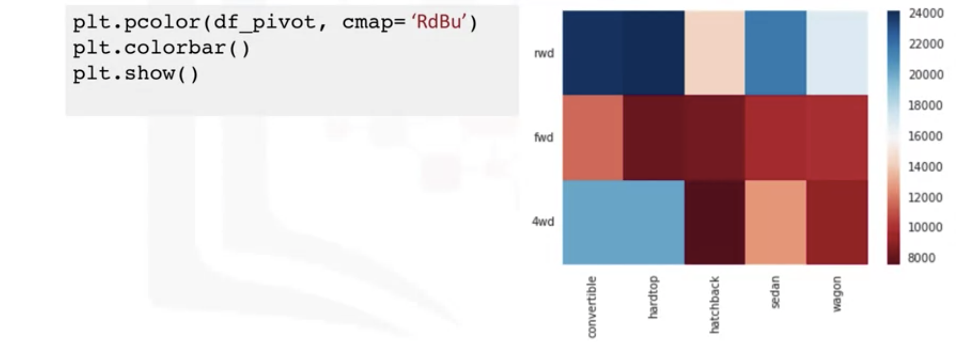
- Heatmap Plot
: Takes a rectangular grid of data and assigns a color intensity based on the data value at the grid point
: good to plot the target variable over multiple variables and target(find out the relationship among them)
: below heatmap seems to have hight prices than the bottom section
: RdBu- red and blue
Correlation
- a statistical metric for measuring to what extent different variables are interdependent
- doesn't imply causation.(we cannot say 2 variables are caused one another, when 2 variables have a certain relationship)
- Positive Linear Relationship(linear line = regression line)
: we can use seaborn.regplot to create scatter plot
sns.regplot(x="engine-size", y="price", data=df)
plt.ylim(0, )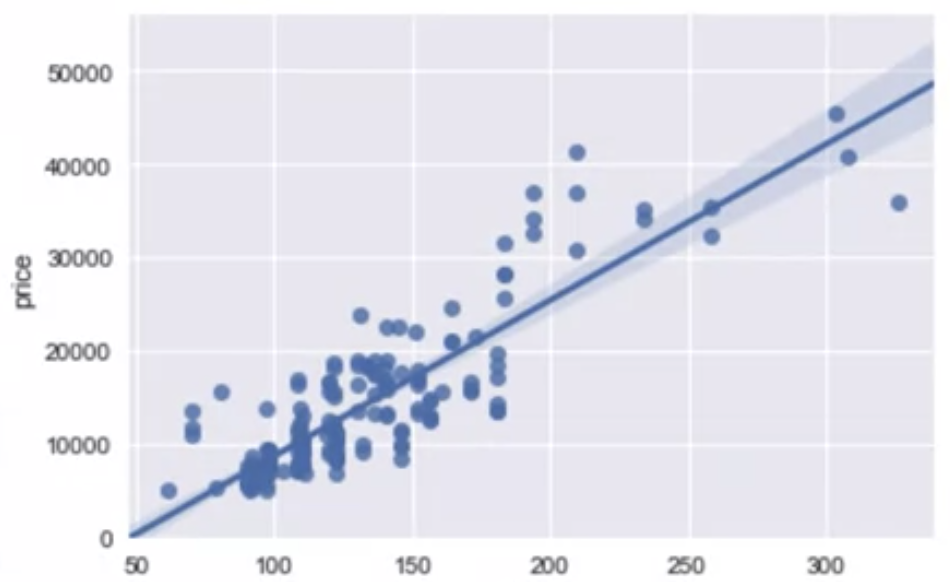
- Negative Linear Relationship

- Weak Corrlation
: the variables can not be used for predicting the values

Correlation - Statistics
- Pearson Correlation
: continuous numerical variables
: give you 2 values (correlation coefficient and p-value)
: Strong correlation - coefficient close to 1 or -1 and P value less than 0.001


#using scify stats PKG
pearson_coef, p_value = stats.pearsonr (df['horsepower'], df['price'])

pearson_coef, p_value = stats.pearsonr(df['wheel-base'], df['price'])
print("The Pearson Correlation Coefficient is", pearson_coef, " with a P-value of P =", p_value)
: result - Pearson correlation 0.81(close to one), P-value 9.35 e-48(very small) -> strong positive correlation
-Correlation-Heatmap
: all the values on this diagonal are highly correlated

Exercise
import matplotlib.pyplot as plt
%matplotlib inline //present the graph on jupyterlab
#use the grouped results
plt.pcolor(grouped_pivot, cmap='RdBu')
plt.colorbar()
plt.show()
fig, ax = plt.subplots()
im = ax.pcolor(grouped_pivot, cmap='RdBu')
#label names
row_labels = grouped_pivot.columns.levels[1]
col_labels = grouped_pivot.index
#move ticks and labels to the center
ax.set_xticks(np.arange(grouped_pivot.shape[1]) + 0.5, minor=False)
ax.set_yticks(np.arange(grouped_pivot.shape[0]) + 0.5, minor=False)
#insert labels
ax.set_xticklabels(row_labels, minor=False)
ax.set_yticklabels(col_labels, minor=False)
#rotate label if too long
plt.xticks(rotation=90)
fig.colorbar(im)
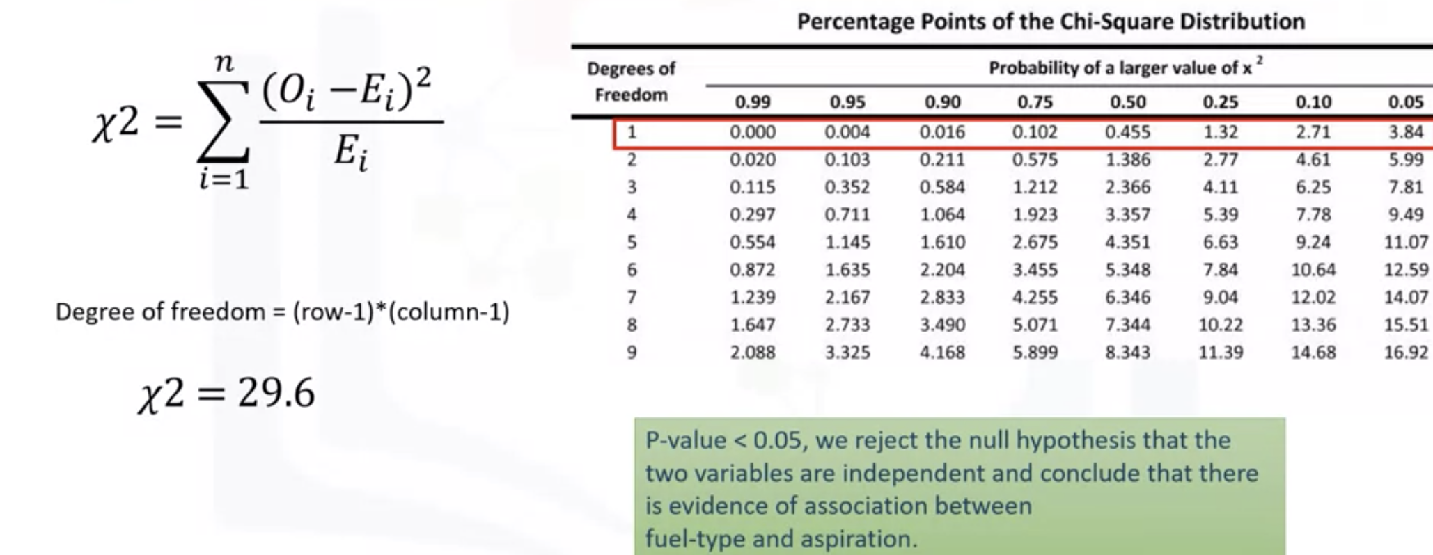
plt.show()Association between two categorical variables: Chi-Square
: between 2 categorical variables - use Chi-square test for association
: how likely it is that an observed distribution is due to chance
: null hypothesis(귀무가설) is that the variables are independent
-> if the data doesn't fit within the expected one, the probability that the variables are dependent becomes stronger
-> proving a null hypothesis is incorrect
: do not tell you the type of the relationship, just whether the relationship exists or not.
: using Pandas crosstab( a contingency table) - shows the counts in each category

: the summation of the observed value (counts in each group - expected value all squared , divided by the expected value
: to get the expected value - follow the above image
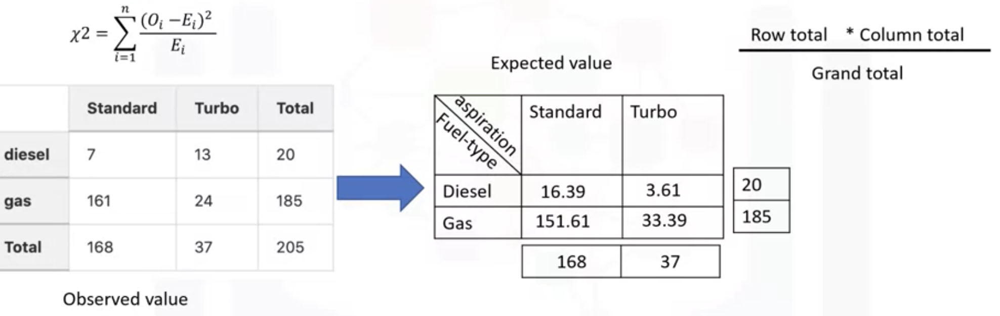
: row -> the degree of freedom(자유도) = the number of samples - 1
: columns -> find the closest chi-squared value
- use the chi-square contingency function in the scipy.stats pkg
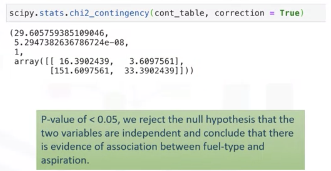
: 29.6 (Chi-square test value) , 5.29...4e-08(p-value, very close to 0), 1 (degree of freedom)
: expected values returned in the array
Exercise Use the "groupby" function to find the average "price" of each car based on "body-style" ?
df_gptest = df[['body-style','price']]
df_group_by_4 = df_gptest.groupby(['body-style'], as_index=False).mean()
df_group_by_4
ANOVA: Analysis of Variance
The Analysis of Variance (ANOVA) is a statistical method used to test whether there are significant differences between the means of two or more groups. ANOVA returns two parameters:
F-test score: ANOVA assumes the means of all groups are the same, calculates how much the actual means deviate from the assumption and reports it as the F-test score. A larger score means there is a larger difference between the means.
P-value: P-value tells how statistically significant is our calculated score value.
If our price variable is strongly correlated with the variable we are analyzing, expect ANOVA to return a sizeable F-test score and a small p-value.
grouped_test2=df_gptest[['drive-wheels', 'price']].groupby(['drive-wheels'])

grouped_test2.get_group('4wd')['price']

# ANOVA
f_val, p_val = stats.f_oneway(grouped_test2.get_group('fwd')['price'], grouped_test2.get_group('rwd')['price'], grouped_test2.get_group('4wd')['price'])

print( "ANOVA results: F=", f_val, ", P =", p_val)
Exercise
1. What is the largest possible element resulting in the following operation? (df.corr())
-> 1, the correlation of a variable with itself is 1
2.10 columns, 100 samples: how large is the output of df.corr()?
-> as there are 10 columns that can be correlated to each other the output of df.corr() will be 10*10
Data Analysis with Python Cognitive Class Answers - Everything Trending
Enroll Here: Data Analysis with Python Module 1 – Introduction Question 1: What does CSV stand for ? Comma Separated Values Car Sold values Car State values None of the above Question 2: In the data set what represents an attribute or feature? Row Column
priyadogra.com
'Data science > Python' 카테고리의 다른 글
| Python Semester 1. (0) | 2023.01.15 |
|---|---|
| [IBM] Data Analysis with Python - Model Development (0) | 2021.05.17 |
| [IBM] Data Analysis with Python - Pre-Processing Data in Python (0) | 2021.05.14 |
| [IBM] Python Project for Data Science - Extracting Stock Data Using a Python Library (0) | 2021.05.11 |
| [IBM]Python for Data Science, AI & Development - Data Analysis (0) | 2021.05.11 |