2021. 5. 17. 18:59ㆍData science/Python
Model Development
- by trying to predict the price of a car using the dataset
- Linear regression
- Model Evaluation using visualization
- Polynomial Regression and pipelines
- R-squared and MSE for in-sample Evaluation
- Prediction and Decision Making
- Model/Estimator: Mathematical equation used to predict the value given one or more other values
Linear Regression and Multiple Linear Regression
- Linear regression: refer to one independent variable to make a prediction
- Multiple Linear regression: refer to multiple independent variables to make a prediction
- Simple Linear Regression: the relationship between 2 variables (predictor- independent and target - dependent)
- Use the training point to fit or train the model and get parameters -> use these parameters in the model -> use model to predict -> compare the predicted values with the actual values(due to noise)
- Fitting a simple Linear model estimator
1. Import lineary_model from scikit-learn
from sklearn.linear_model import LinearRegression2. create a linear regression object using the constructor : lm = LinearRegression()
3. Define the predictor variable and target variable
X = df[['highway-mpg']]
Y = df['price']
4. use lm.fit(X,Y) to fit the model - to find the parameters
5. obtain a prediction : Yhat = im.predict(X)
6. The output is an array. (Same number of samples as the input X)
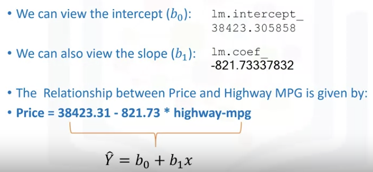
- SLR (Estimated Linear Model)
: We can view the attribute of the object lm - b_0(intercept) and b_1(slope)
* intercept: the value of Y when X is 0 / slope: the value with which Y changes when X increases by 1 unit
- MLR(Multiple linear regression) : One continuous target(Y) and 2 or more predictor(X)

- the predictor variables can be placed on a 2D plane. -> each variables X_1 and X_2 will be mapped to a new value y -> The new values y hat are mapped in the vertical direction with height proportional to the value that y hat takes

- Fitting a multiple linear model estimator
1. Extract for 4 predictor variables and store them in the variable Z
: Z = df[['horsepower', 'curb-weight', 'engine-size', 'highway-mpg']]
2. Train the model : lm.fit(Z, df['price'])
3. obtain prediction : Yhat = lm.predict(X)
-> Input is an array or data frame with 4 columns(4 predictors)/ the number of row is same as the numbele of samples
-> output is an array with the same number of elements as number of samples
4. We can view the attribute of the object lm - b_0(intercept) and b_1, b_2, b_3, b_4(coefficients)

Model Evaluation using Visualization
- Regression Plot
: Good estimate of "the relationship between 2 variables", "strength of the correlation", "direction of the relationship(positive or negative)
- Horizontal axis - independent variable / vertical - dependent variable
- regplot from the seaborn library is the easiest way
: When it comes to simple linear regression, an excellent way to visualize the fit of our model is by using regression plots.
This plot will show a combination of a scattered data points (a scatter plot) and the fitted linear regression line going through the data. This will give us a reasonable estimate of the relationship between the two variables, the strength of the correlation, as well as the direction (positive or negative correlation).
import seaborn as sns

width = 12
height = 10
plt.figure(figsize=(width, height))
sns.regplot(x="highway-mpg", y="price", data=df)
plt.ylim(0,)
-> pay attention to how scattered the data points are around the regression line
->too far off from the line, this linear model might not be the best model for this data
- Residual plot
: represents the error between the actual value
: Examining the predicted value and actual value -> see a difference
: The difference between the observed value (y) and the predicted value (Yhat) is called the residual (e)

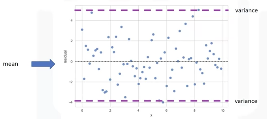
-> There is no curvature(randomly spread out around X-axis)
: this type of residual plot suggests a linear plot is appropriate!

-> There is a curvature. The values of the error change with X. positive-> negative->positive
: Non-linear model may be more appropriate

-> Variance of the residuals increases with X. -> model is not correct
-> If the points in a residual plot are randomly spread out around the x-axis, then a linear model is appropriate for the data. Why is that? Randomly spread out residuals means that the variance is constant, and thus the linear model is a good fit for this data.
- Create a residual plot with residplot function
import seaborn as sns

#Residual plot
width = 12
height = 10
plt.figure(figsize=(width, height))
sns.residplot(df['highway-mpg'],df['price'])
plt.show()

#the result: residuals are not randomly spreaded -> non-linear model is more appropriate

-Distribution plot
: counts the predicted value versus the actual value
: good for visualizing models with more than one independent variables or feature
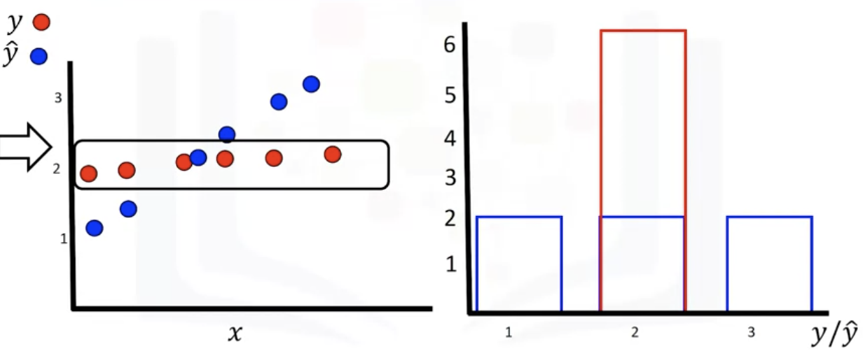
-> blue : predicted, red: target values
-> both values are continuous -> convert them to a distribution(histogram is for discrete)
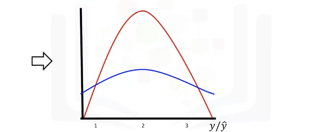
- Example of using a distribution plot
: dependent variable or feature is price
: fitted values that result from the model - blue, actual - red
: middle part more accurate

- create the distribution plots
import seaborn as sns

#make a prediction
Z = df[['horsepower', 'curb-weight', 'engine-size', 'highway-mpg']]
Y_hat = lm.predict(Z)

plt.figure(figsize=(width, height))

ax1 = sns.distplot(df['price'], hist=False, color="r", label="Actual Value")
sns.distplot(Y_hat, hist=False, color="b", label="Fitted Values", ax=ax1)

plt.title('Actual vs Fitted Values for Price')
plt.xlabel('Price (in dollars)')
plt.ylabel('Proportion of Cars')

plt.show()
plt.close()
: hist=false -> show distribution plot instead of histogram
Polynomial Regression and Pipelines
- Transform data to polynomial -> then use linear regression to fit the parameter
: a particular case of the general linear regression model or multiple linear regression models. We get non-linear relationships by squaring or setting higher-order terms of the predictor variables
- Pipelines: a way to simplify the code
- Polynomial Regressions
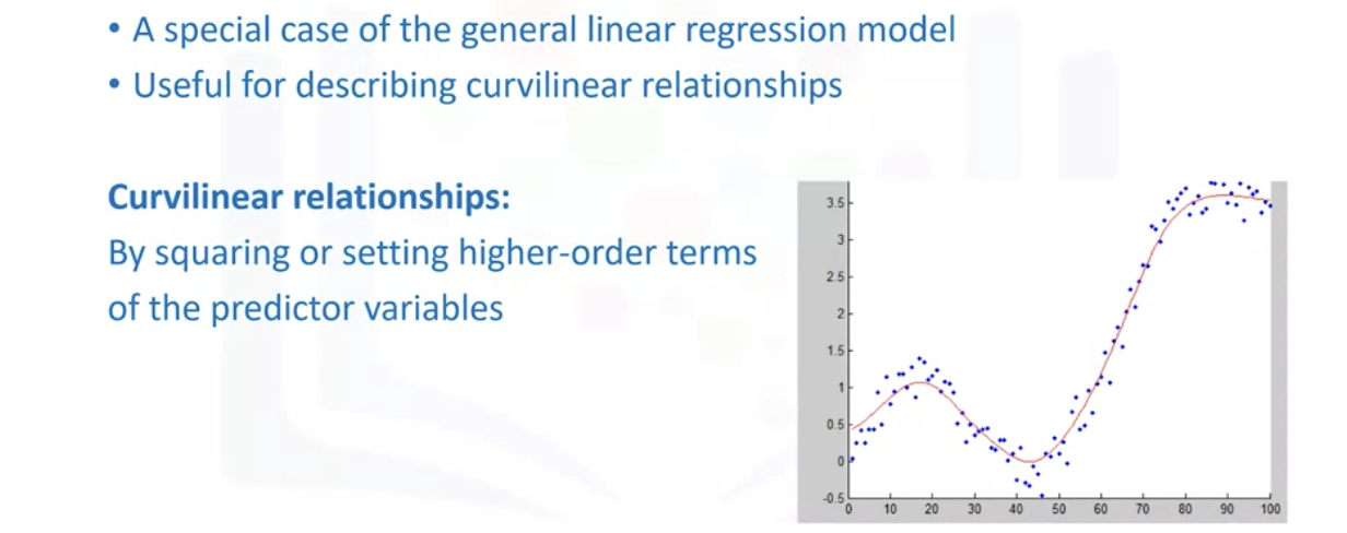
: the model can be quadratic - predictor variable in the model is squared

: if the good fit hasn't been achieved by 2nd or 3rd, higher-order can be used.
: degree of regression makes a big difference + result in a better fit with the right value
: All cases variables and parameters are always in a linear relationship
Which statement is true about Polynomial linear regression?
Although the predictor variables of Polynomial linear regression are not linear the relationship between the parameters or coefficients is linear
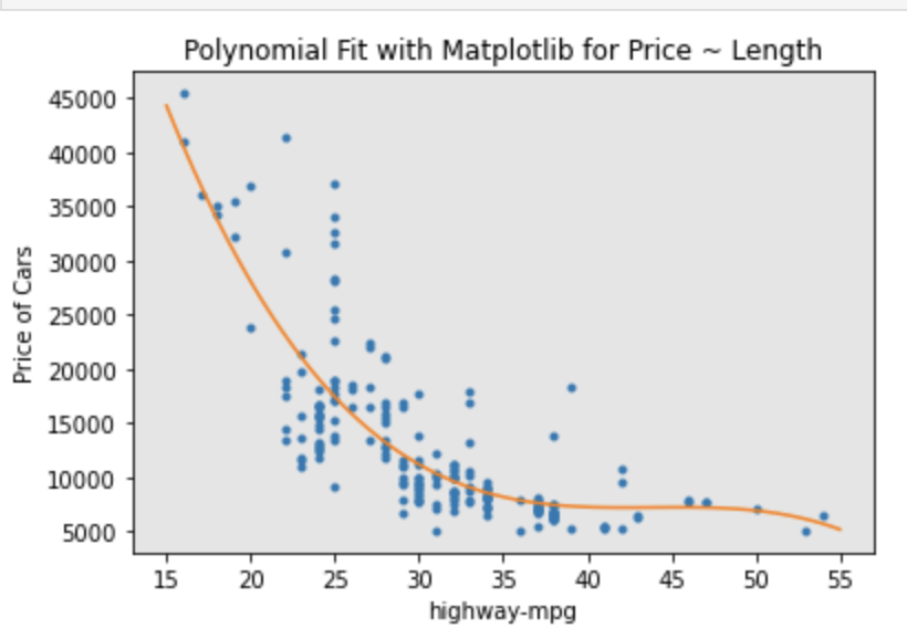
- Example of Polynomial regression model with polyfit function
1. Calculate polynomial of 3rd order
: f = np.ployfit(x,y,3)
: p = np.poly1d(f)
2. we can print out the model: print(p)

: symbolic form for the model is like above
#Polynomial Regression

#plot the data
def PlotPolly(model, independent_variable, dependent_variabble, Name):
    x_new = np.linspace(15, 55, 100)
    y_new = model(x_new)
# y = linspace( x1,x2 , n ) generates n points. The spacing between the points is (x2-x1)/(n-1

    plt.plot(independent_variable, dependent_variabble, '.', x_new, y_new, '-')
    plt.title('Polynomial Fit with Matplotlib for Price ~ Length')
    ax = plt.gca()  #get current axe
    ax.set_facecolor((0.898, 0.898, 0.898))
    fig = plt.gcf()  #get current feature
    plt.xlabel(Name)
    plt.ylabel('Price of Cars')

    plt.show()
    plt.close()

x = df['highway-mpg']
y = df['price']

# Here we use a polynomial of the 3rd order (cubic)
f = np.polyfit(x,y,3)
p = np.poly1d(f)
print(p)
-----------------------------------------
        3         2
-1.557 x + 204.8 x - 8965 x + 1.379e+05
-----------------------------------------

PlotPolly(p, x, y, 'highway-mpg')
np.polyfit(x, y, 3)
-------------------
array([-1.55663829e+00,  2.04754306e+02, -8.96543312e+03,  1.37923594e+05])
# Create 11 order polynomial model with the variables x and y from above?
f1=np.polyfit(x,y,11)
p1=np.poly1d(f)
print(p1)
PlotPolly(p1, x, y, 'highway-mpg')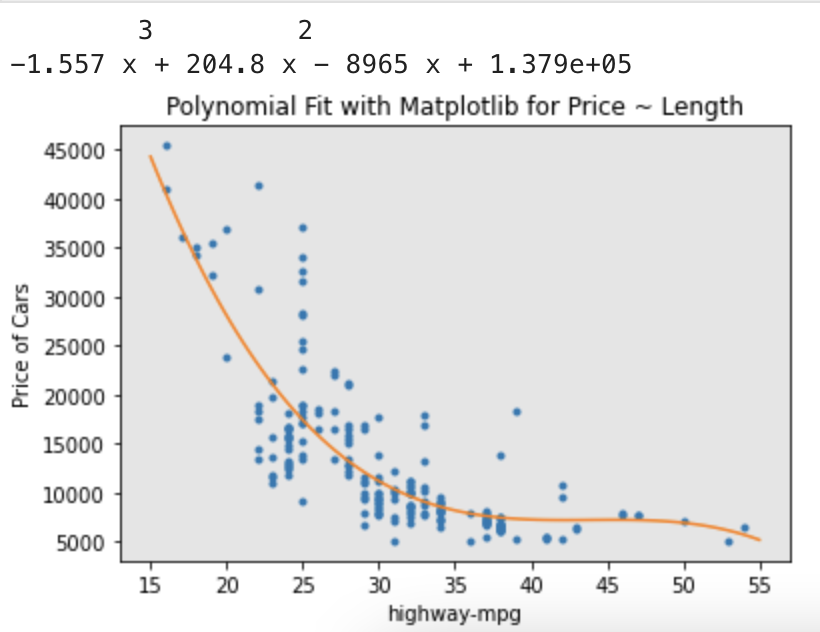
- Multi-Dimensional polynomial linear regression

: Numpy's polyfit function cannot perform this type of regression
: Use preprocessing library from scikit-learn to create a polynomial feature object
from sklearn.preprocessing import PolynomialFeatures
pr = PolynomialFeatures(degree=2, include_bias=False)

#transform the features into polynomial feature
x_polly = pr.fit_transform(x[['horsepower','curb-weight']])


#Multivariable Polynomial

from sklearn.preprocessing import PolynomialFeatures
#create PolynomialFeature object of degree 2
pr = PolynomialFeatures(degree = 2)
pr

Z_pr=pr.fit_transform(Z)
Z.shape    # The original data is of 201 samples and 4 features
Z_pr.shape   # after the transformation, there 201 samples and 15 features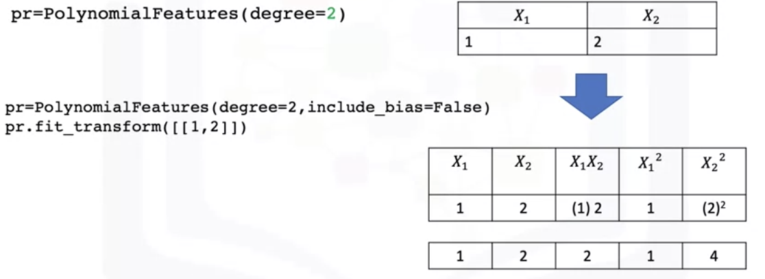
- Pre-processing
: As the dimension of the data gets larger -> normalize multiple features in scikit-learn
from sklearn.preprocessing import StandardScaler

#train the object
SCALE = StandardScaler()

#fit the scale object
SCALE.fit(x_data[['horsepower','highway-mpg']])

#transform the data into a new data frame on array x_scale
x_scale = SCALE.transform(x_data[['horsepower', 'highway-mpg']])
- Pipelines
: simplify the code by using pipeline library
: Process to getting a prediction- normalization-> polynomial transform -> linear regression
-> simplify this process using a pipeline

# import all the library we need
from sklearn.preprocessing import PolynomialFeatures
from sklearn.linear_model import LinearRegression
from sklearn.preprocessing import StandardScaler

#import pipeline library
from sklearn.pipeline import Pipeline

#create the list of tuples [('name of the estimator', model constructor), ...]
Input = [('scale', StandardScaler)), ('polynomial', PolynomialFeatures(degree=2, ...
'mode', LinearRegression())]

# input the list in the pipeline constructor / normalize the data
.Pipeline constructor
pipe = Pipeline(Input)

#Train the pipeline by applying the train method to the pipeline object
##normalize , perform a transfomr and produce prediction
Pipe.fit(df[['horsepower', 'curb-weight', 'engine-size', 'highway-mpg']],y)
#prediction
yhat = Pipe.predict(X[['horsepower', 'curb-weight', 'engine-size', 'highway-mpg']])
Create a pipeline that Standardizes the data, then perform prediction using a linear
regression model using the features Z and targets y
Input=[('scale',StandardScaler()),('model',LinearRegression())]
pipe=Pipeline(Input)
pipe.fit(Z,y)
ypipe=pipe.predict(Z)
ypipe[0:10]Measures for In-Sample Evaluation
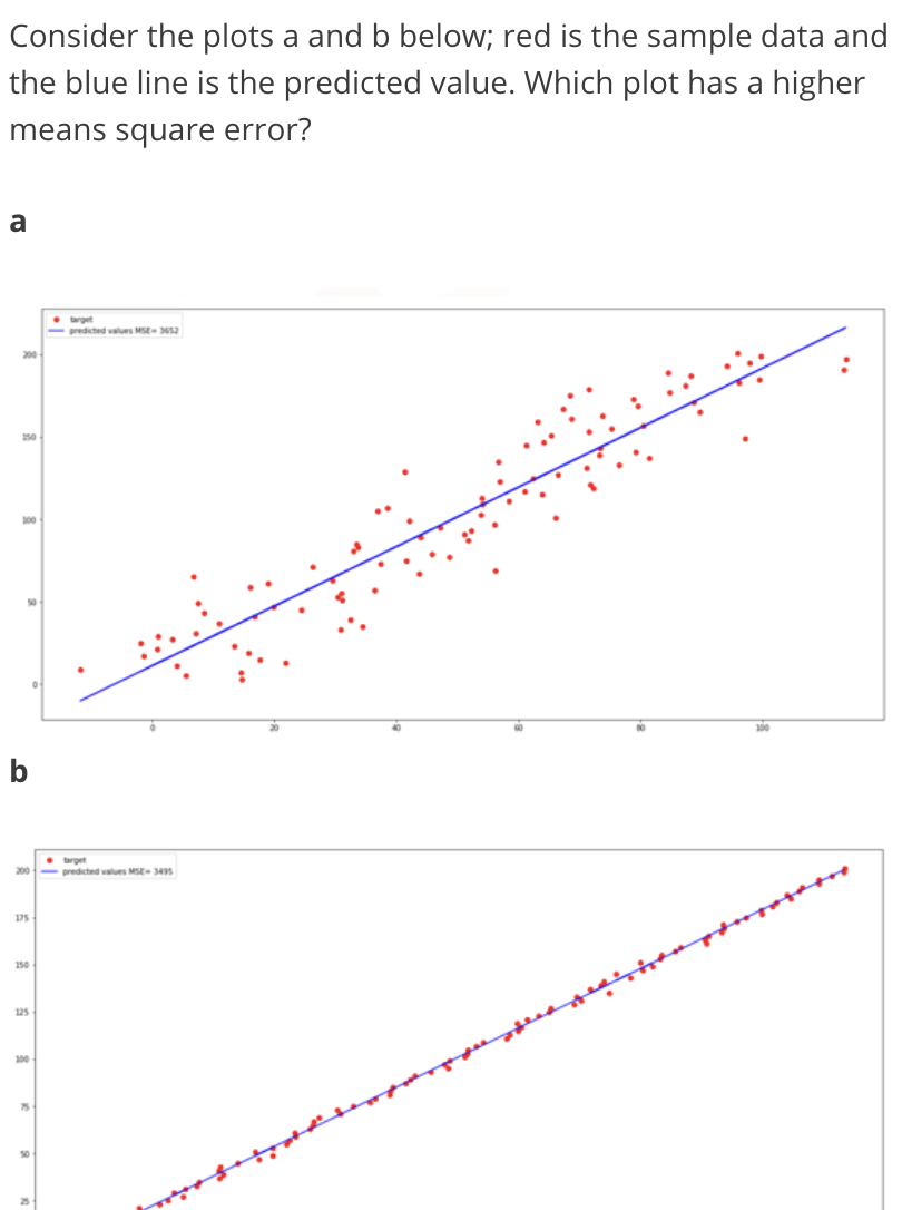
- When evaluating our models, not only do we want to visualize the results, but we also want a quantitative measure to determine how accurate the model is.
- A way to numerically determine how good the model fits on a dataset
- 2 important measures: Mean Squared Error(MSE), R-squared (R^2)
- MSE(Mean Squared Error)
1. find the difference between the predicted value and actual value then square it
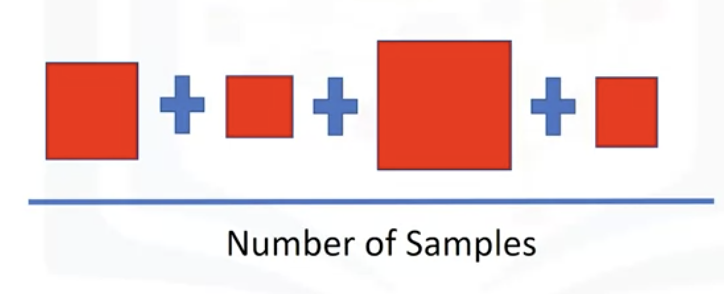
2. collect all the squared one and divided it by the number of samples.


#Model 1 SImple Linear Regression
#MSE

#predict the output
Yhat = lm.predict(X)
print('The output of the first four predicted value is: ', Yhat[0:4])

from sklearn.metrics import mean_squared_error

mse=mean_squared_error(df['price'], Yhat)
print('The mean square error of price and predicted value is: ', mse)

-----------
The output of the first four predicted value is:  [16236.50464347 16236.50464347 17058.23802179 13771.3045085 ]
The mean square error of price and predicted value is:  31635042.944639888
# Model 2: Multiple Linear Regression
Y_predict_multifit = lm.predict(Z)
print('The mean square error of price and predicted value using multifit is: '\
, mean_squared_error(df['price'], Y_predict_multifit))
----------------
The mean square error of price and predicted value using multifit is: 11980366.87072649# Model 3: Polynomial Fit - MSE
mean_squared_error(df['price'], p(x))
-------------
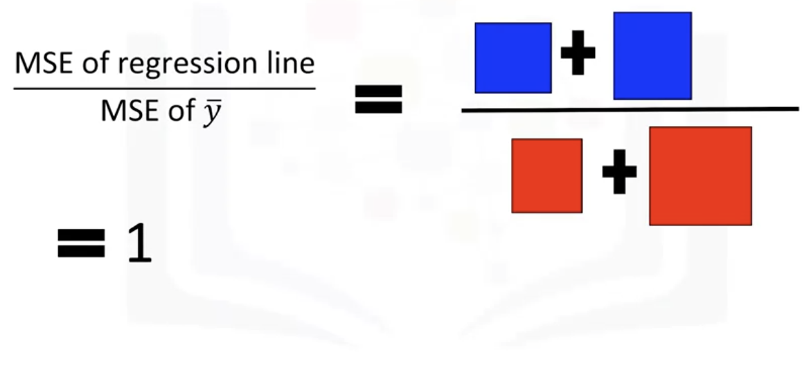
20474146.426361203-R-squared(R^2)
: also called the Coefficient of Determination
: measure to determine how close the data is to the fitted regression line
: how close is the actual data to the predicted estimated model
: R^2 is the percentage of variation of the target variable(Y) that is explained by the linear model
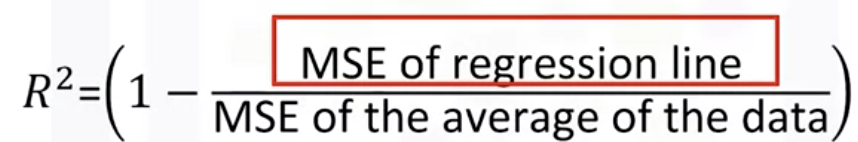

-> ratio of the areas of MSE is close to zero


-> R^2 = 1 , which means the line is a good fit for the data
- Bad Example


#Model 1 SImple Linear Regression
X = df([['highway-mpg']])
Y = df['price']

lm.fit(X,Y)

lm.score(X, y)
--------------------------------------------------
0.496591188
49.659% of the variation of the price is explained
by this simple linear model "highway-mpg fit"
# Model 2: Multiple Linear Regression
#R^2
lm.fit(Z, df['price'])
print('The R-square is: ', lm.score(Z, df['price']))
-----------
The R-square is: 0.8093562806577457
80.896 % of the variation of price is explained
by this multiple linear regression "multi_fit".# Model 3: Polynomial Fit
#R^2
from sklearn.metrics import r2_score
r_squared = r2_score(y, p(x))
print('The R-square value is: ', r_squared)
----------------
The R-square value is: 0.6741946663906522
67.419 % of the variation of price is explained by this polynomial fit- generally, the values are between 0 and 1, if the value is negative -> overfitting
Prediction
- Make sure the model results make sense, visualization, Numerical measures for evaluation, comparing models
1. Train the model: lm.fit(df['highway-mpg'], df['price'])
2. predict the price with 30 highway-mpg: lm.predict(np.array(30,0).reshape(-1,1)) -> result $ 13771.30
-> value is not gegative, extremely high or low
-> check the coefficients by examining the coeff_ attribute -> lm.corf_: -821.73337832
-> price = 38423.31 - 821.73 * highway-mpg
- To generate a sequence of values in a specified range
import matplotlib.pyplot as plt
import numpy as np
%matplotlib inline

#1. crate input
new_input = np.arrange(1,101,1).reshape(-1,1)

#2.fit model
lm.fit(X,Y)

#3. predict
yhat=lm.predict(new_input)
yhat[0:5]

#4. plot the data
plt.plot(new_input, yhat)
plt.show()* reshape(-1, 1): when you use -1 in reshape, the length of the dimenstion is determined by inferring from the other dimensions. For instance, if shape(2,3) -> it has 6 values in the array. -> reshape(-1,1)-> make sure th keep all the values in 1 column -> shape(6,1) Another example, if applying reshapre(1,-1)-> all the values in 1 row-> shape(1,6)
* arange(1, 100, 1) : start , end, term
-> output to predict new values
-> output is a numpy array
-> first method to try to visualize the data = regression plot
- R squared values should be at least 0.1 (Falcon Millaert suggested)
Decision Making
When comparing models, the model with the higher R-squared value is a better fit for the data.
When comparing models, the model with the smallest MSE value is a better fit for the data.
Simple Linear Regression model (SLR) vs Multiple Linear Regression model (MLR)
Usually, the more variables you have, the better your model is at predicting, but this is not always true. Sometimes you may not have enough data, you may run into numerical problems, or any of the variables may not be useful and or even act as noise. As a result, you should always check the MSE and R^2.
Simple Linear Regression: Using Highway-mpg as a Predictor Variable of Price.
|
Multiple Linear Regression: Using Horsepower, Curb-weight, Engine-size, and Highway-mpg as Predictor Variables of Price.
|
Polynomial Fit: Using Highway-mpg as a Predictor Variable of Price.
|
- The MSE of SLR is 3.16x10^7 > MLR has an MSE of 1.2 x10^7. (smaller better)
- The R-squared for the SLR (~0.497) < R-squared for the MLR (~0.809).(higher better)
-> MLR seems like a better model fit compared to SLR
'Data science > Python' 카테고리의 다른 글
| Python - np.empty vs. np.zeros (0) | 2023.02.15 |
|---|---|
| Python Semester 1. (0) | 2023.01.15 |
| [IBM]Data Analysis with Python - Exploratory Data Analysis(EDA) (0) | 2021.05.15 |
| [IBM] Data Analysis with Python - Pre-Processing Data in Python (0) | 2021.05.14 |
| [IBM] Python Project for Data Science - Extracting Stock Data Using a Python Library (0) | 2021.05.11 |